Top 5 Ways To “Actively Convert” Visitors of your Website
LOW CONVERSIONS?
If you’re struggling with your website conversions, you’re not alone.
Here are some pretty sobering stats…
You only have 0-8 seconds to impress a first time visitor, before they turn around and leave
On average, only 2% of website visitors actually buy at any given visit
It takes 7 interactions on average to convert a lead into a customer
These numbers might make painful reading. But they also show us how much room there is for conversion optimization…
So what can we learn from them?
KEY INSIGHTS…
First impressions are critical. Your audience takes a huge dive after 8 seconds. So like a Bond movie, you need a big “all-action” opening scene. Don’t be afraid to call your audience to action immediately (otherwise it might be too late)…
The sales process involves multiple interactions and touchpoints. So it’s better to think of your website as just one piece of a sales funnel, that comprises ads (and retargeting ads), landing pages, blog posts, emails, and social media posts…
And therefore…
Re-marketing is key. If you’re not able to re-connect with your visitors once they leave your website – via both email and re-targeting ads – you’re throwing away 98% of your leads..!
So in this post I want to show you 5 ways you can actively convert every website visitor into a re-marketing lead…
ACTIVE VS PASSIVE CONVERTING

website conversion
So what is does it mean to “actively convert” your website visitors?
The best way to illustrate this is by comparing online conversions to real-life. Because web-traffic is just people (even though it’s easy to forget this!).
So let’s imagine 2 small “bricks-and-mortar” businesses; a couple of local grocery stores…
These stores look identical to each…stocked with the same products, in exactly the same way.
However, your experience of each one is very different.
In the first store, when you walk in…
…no-one looks up; no one smiles, or says “hi”…
No one reacts when you pick up a product…
And when you walk to the door and leave, you’re still ignored...
In contrast, when you enter the second store…
You’re greeted with a smile…
The shopkeeper asks you how they can help…
When you look at at a product, they give you some more information about it; suggest some other products that you might also like…
And when you go to leave, you’re offered a special discount…
Which store are you more likely to buy from? It’s no contest right?
The second store does much better, despite having exactly the same products and layout as the first store…
So why is this?
Well, in the 1st store, it’s as if you’re not there. Your presence does not affect them. They’re completely passive.
In contrast, from the moment you enter the 2nd store, it “comes alive”, and they create a personal, interactive experience for you.
The store re-acts to you, and your individual behavior.
In other words, they attempt to “actively convert” you.
A good salesperson knows that sales is about responding to your prospect. Not just “pitching” at them; but creating an interactive dialogue with them…
In a face-to-face setting, this is mainly about observing body-language, and reacting in the right way (according to one Harvard study, 55% of face-to-face communication is via body-language! It’s our main “clue” to what someone is really thinking).
…If your prospect looks disinterested, you try a new angle, or suggest a new product. If they look interested, you push to close the sale, etc…
But how do you actively convert people on your website? How can you make the online sales process more like it is face-to-face – when it’s done properly? Afterall, you can’t observe-&-respond to your visitors’ body language when they’re on your website, can you?
True, you cannot see their physical body language. But you can respond to their “Digital body language”…
You can respond when a visitor:
…enters your site…
Scrolls through your content
Clicks on, or hovers over, specific items …
Goes to exit your site…
These are all moments when you can jump in, and actively convert your visitors.
Here’s how…
THE 5 ACTIVE CONVERSION LEVERS
1. PIXEL BANKING
What is it?
This first way of converting your website visitors to remarketing leads is invisible, but increasingly important…
Pixel Banking allows you to build audiences of everyone who visits your web-properties – whom you can then “re-target” with contextual ads on Facebook, Youtube, Instagram, and 1000s of other websites via ad-networks.
Why does it work?
Pixeled audiences are pre-qualified leads; they have already shown interest in you. So unsurprisingly, retargeting ads give you much better ROI.
In the words of Digital Marketer CEO Ryan Deiss:
“Soon all display advertising will be retargeted advertising and the pixel will become even more valuable than the click itself. As larger advertisers continue to buy up ad inventory (and create their own retargeting audiences) those that fail to ‘pixel’ their site visitors won’t be able to afford to advertise.”
Remember, most people don’t buy on their first visit to your website, or even their second…
So as digital marketers, we must build these pixeled audiences (on Facebook, Google, YouTube, etc.) so that we can leverage them, now and in the future. These audiences are just as valuable your email lists.
How do I add it?
You can add your retargeting code to ALL your MyLeadzz campaigns. Just copy & paste the pixel code from the advertising platform (eg., Facebook) into your MyLeadzz campaigns.

Note re. “Onsite” re-targeting: You can also using pixels to trigger (or hide) popups or Conversion Mats for returning visitors. This is another great way of making the sales process more relevant, personal, and effective.
2. CONVERSION MAT
What is it?
A full-screen call-to-action that displays when your visitors land on your site.

Use these ‘Mats to welcome first-time visitors, announce new products & promotions, deliver coupons, capture email subscribers, and more…
Why does it work?
This is like the shopkeeper who welcomes you to their store as you enter…
By adding a ‘Mat to your website, your site reacts to your visitors when they enter. You show your visitors that they’re important to you…
But more importantly, this gives you an opportunity to instantly convert your prospects (eg., to subscribe or share), before they get distracted and move on.
Remember, a large portion of your visitors leave within 8 seconds. But by dynamically “interrupting” their normal browsing behaviour, Conversion Mats instantly grab their attention – making your call-to-action unmissable.
How do I add it?
Create your own Conversion Mat with MyLeadzz Amplify.
Simply select a template, customize your design with our drag-and-drop builder, and then connect MyLeadzz to your website.
So once you’ve made a great first impression with MyLeadzz Amplify, how do you keep your visitors engaged..?
3. SCROLL BOX
What is it?
A call-to-action box that pops up or slides-in as your visitor scrolls through your page. You can set it to be triggered at certain points down the page (e.g., 50%, 80%, etc.)

Use scroll boxes to ask your visitors for their email address as they finish reading your latest blog post, offer a trial as they finish learning about your product, highlight key information on your page, and much more…
Why does it work?
This is a timely, unobtrusive way of delivering your message.
Scroll-boxes convert well because you can set your them to appear at a relevant moment in your visitors’ experience. For example, you could show a scroll-box with a related opt-in (e.g., “enter your email download the full guide here”) that appears when readers get to the end of your blog post.
They’re a more natural (less annoying!) way of getting your prospects to move to the next step in the sales journey…
Pro Tip: set your scroll-boxes to appear in the corner of the page – so your visitors can continue to read your site without having to close them down. This will boost your conversions further
4. CONTEXTUAL POPUP
What is it?
A popup that’s triggered when your visitor clicks or hovers over a specific image, button or text (of your choice).

Why does it work?
Like Scroll-boxes, contextual popups deliver your message in response to your visitors’ behaviour, so they are more timely and relevant.
For example, if you use a button or text (like THIS! ) to trigger the popup, visitors who click on the button/text make a “micro-commitment” before your call-to-action shows.
So don’t be surprised if you see them convert at over 50%!

5. EXIT OFFERS
What is it?
A pop-over that shows to your visitors when they exhibit “exit intent” behaviour (i.e., they move their mouse to close the tab).

NB: Page close popups (triggered by clicking the tab “X”) are not permitted by most advertising networks, but exit intent popups are allowed.
Why does it work?
Remember, on average, over 90% of your website visitors leave without taking any action…
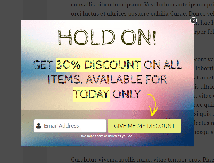
You can use exit pops to give these abandoning visitors a new incentive to stay (or at least not leave empty-handed) – a discount coupon, special report, etc…
This gives you a chance to convert visitors who would otherwise be lost – so any conversions they achieve are a bonus!
How do I add behaviour-driven popups to my website?
Create your own Scroll-Boxes, Contextual Popups & Exit Offers with MyLeadzz Engage.
Simply select a template, customize your design with our drag-and-drop builder, and then connect MyLeadzz to your website.

By adding these 5 active conversion levers to your website you will:
Immediately grab your visitors’ attention
Dynamically respond to their browsing cues (“digital body-language”)
Give yourself multiple bites at the cherry
…and generate more leads and customers as a result.
To maximize your conversions, we recommend you add at least 2 of the above levers to every single webpage.
So give them a try – and see how they boost your website!
Which of these Levers are you already using on your site? Do you think you’ll get more out of your website traffic by adding these? Let us know in the comments below!
Originally posted by Yelp WiFi

